Innovating with Color: Modernizing the Traditional Palette of Japanese Bookbinding
Japanese bookbinding is an ancient art form that combines refined manual skills and a deep respect for aesthetics. This traditional technique has deep historical roots in Japan and is known for its elegant simplicity and lasting functionality. However, as with any form of artistic expression, Japanese bookbinding is not immune to the influence of time and contemporary trends. A recent approach that has gained prominence is the modernization of the color palette used in this process. In this article, we’ll explore how artisans are innovating with color, bringing new life to the traditional palette of Japanese bookbinding.
Table of Contents
The Tradition of Japanese Bookbinding
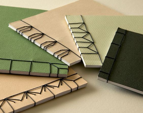
Japanese binding, known as “Yotsume toji” or “4-hole binding”, is characterized by its simplicity and efficiency. Traditionally, it uses a minimum number of materials and tools, which makes it affordable and sustainable. The process involves punching four holes in the stack of pages and then meticulously threading thread through these holes, creating a distinctive stitching pattern. The result is a book that opens flat and allows for a pleasant reading experience.
The Traditional Color Palette
Japanese bookbinding is a traditional bookbinding technique that originated in Japan. It is known for its aesthetic beauty and simplicity, and is often used to create books, photo albums, and other types of publications. One of the distinguishing features of Japanese binding is the use of exposed stitching on the spine of the book, which can be done in a number of different ways depending on the specific style of binding being used.
The choice of colors in Japanese binding, including the traditional color palette, plays an important role in the aesthetics of the design. The traditional Japanese color palette is influenced by the culture, nature, and traditions of Japan. Some common colors and their meanings in Japanese culture include:
- Red (Akai): Symbolizes love, passion and energy. It is a color often used in wedding ceremonies and festivals.
- White (Shiro): Represents purity, simplicity and truth. It is a color associated with religious and mourning rituals.
- Blue (Aoi): Symbolizes serenity, tranquility and harmony. It is a color often seen in Japanese nature, such as the sky and ocean.
- Green (Midori): Represents youth, renewal and hope. It is a color associated with spring and vegetation.
- Black (Kuro): Symbolizes darkness, death and mystery. It is also used to represent elegance and sophistication.
- Golden (Kin): Represents wealth, prosperity and power. It is often used in festive decorations and ceremonial attire.
- Silver (Gin): Symbolizes purity and sincerity, as well as white. It is also used on festive occasions.
When creating a Japanese book or binding project, you can choose colors from the traditional palette that align with the meaning or atmosphere you want to convey. Additionally, the selection of high-quality papers and attention to detail in stitching and overall design are essential to creating an authentic and aesthetically pleasing piece of Japanese binding.
Color Palette Modernization
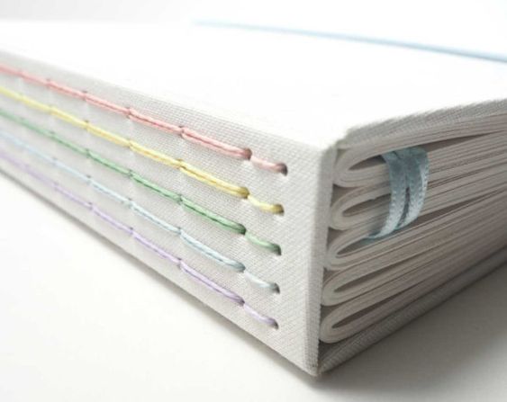
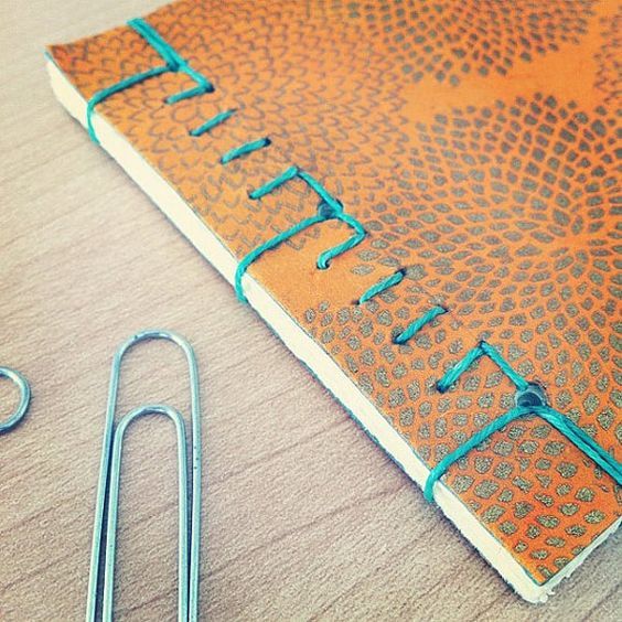
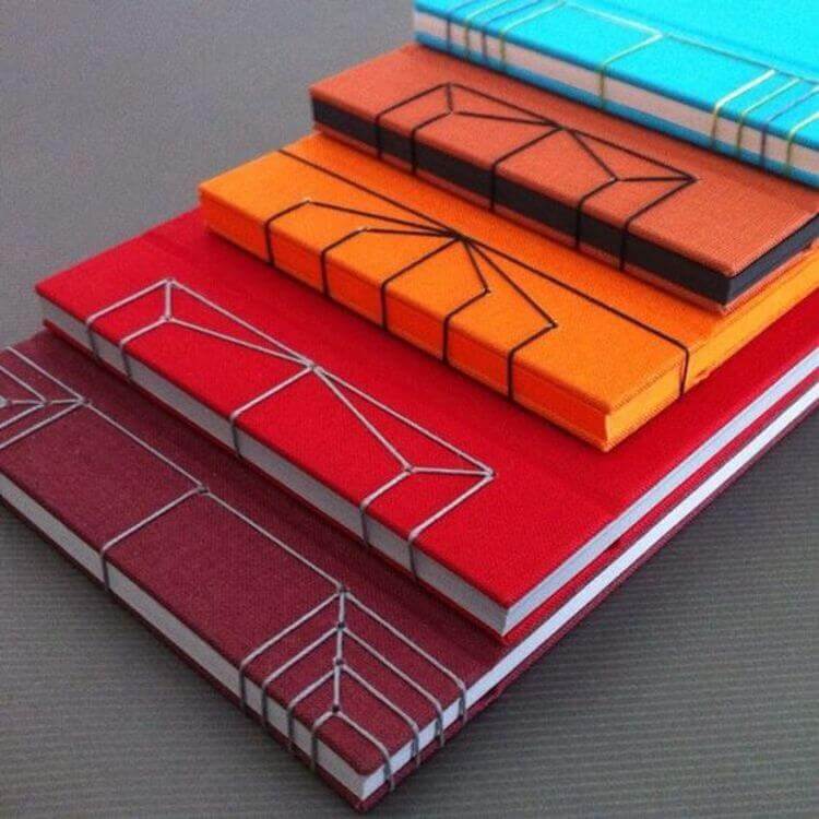
However, contemporary artisans are challenging this tradition by introducing a wider range of colors to Japanese binding. The modernization of the color palette aims to attract a more diverse audience and align with constantly evolving aesthetic sensibilities. Vibrant colors such as turquoise, soft pink, and even metallic tones are finding their way into Japanese binding designs.
Colors that Tell Stories
Modern practitioners are recognizing the power of color to tell stories and evoke emotions. By incorporating bolder, more expressive colors into their bindings, they can convey a sense of energy, passion and creativity. For example, a photo album with blue and yellow binding can capture the joy of sunny moments and happy memories.
Here are some ways to explore this idea:
- Thematic Colors: Use specific colors that have symbolic or historical meanings related to the content of the book. For example, if the book is about Japanese nature, use shades of green, blue, and brown to evoke the landscape and flora of Japan.
- Visual Narrative: Create a progression of colors throughout the pages of the book to accompany the narrative or story being told. Start with soft, neutral tones, and as the story develops, intensify the colors to reflect emotional shifts or pivotal events.
- Significant Contrast: Use contrasting colors to highlight important elements within the book. For example, reserve a vibrant color like red for standout moments or to highlight meaningful quotes.
- Seasons: If the book covers different seasons, you can choose colors that correspond to each season. For example, green tones and florals for spring, warm colors and golden leaves for autumn, and so on.
- Cultural History: Use colors that are rooted in Japanese history and culture to create a sense of authenticity and connection to the theme. This may include using red and white to celebrate traditional Japanese festivals.
- Character Palette: If the book features characters, associate specific colors with each of them to create a unique visual identity and make identification easier for readers.
- Balance and Harmony: Remember that Japanese binding is known for its balanced and harmonious aesthetic. Make sure the colors you choose complement each other and create an overall feeling of beauty and balance.
Remember that your choice of colors should be deliberate and meaningful, contributing to the narrative or the reader’s overall experience. Japanese binding offers a unique opportunity to integrate the color palette in an elegant and artistic way, enriching the story being told.
Connecting Traditional to Contemporary
Modernizing the color palette does not mean completely abandoning traditional roots. On the contrary, artisans are looking for ways to harmoniously integrate modern colors with the traditional elements of Japanese bookbinding. This creates a bridge between the past and the present, honoring the rich heritage while embracing contemporary creativity.
Attracting New Audiences
The introduction of bolder, more vibrant colors is helping to attract a new generation of Japanese bookbinding enthusiasts. Young people, especially, tend to be more attracted to projects that reflect their expressiveness and individual style. By modernizing the color palette, artisans are making Japanese bookbinding relevant and exciting to a wider audience.
To innovate and reach new audiences, consider the following strategies:
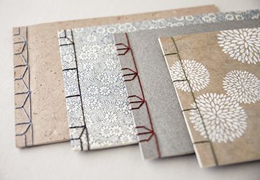
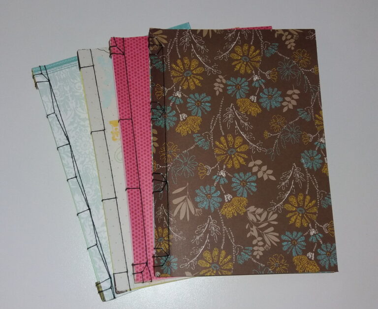
- Contemporary Design: By incorporating contemporary design elements, you can attract readers who appreciate the combination of tradition and modernity. Experiment with patterns, illustrations, and modern typography, keeping Japanese bookbinding technique as a central element of the design.
- Multicultural Themes: Explore multicultural themes and stories that can appeal to a diverse audience. Use colors, illustrations, and visual elements that reflect Japanese culture and traditions, but are also accessible and relevant to a global audience.
- Customization and Personalization: Offer custom Japanese binding services, allowing customers to choose their own colors, materials and designs. This can appeal to people who want to create unique and meaningful books.
- Workshops and Courses: Promote workshops and courses on Japanese bookbinding to engage new audiences interested in learning the technique. This can include students, artists, writers, and art lovers looking for a hands-on, creative experience.
- Creative Collaborations: Collaborate with artists, writers, graphic designers, or other creative professionals to create unique Japanese binding designs. These collaborations can attract followers and fans of the collaborators involved.
- Technology and Social Media: Use social media and technology to promote your work. Share images of the binding process, video tutorials, or even offer custom binding services online to reach a wider audience.
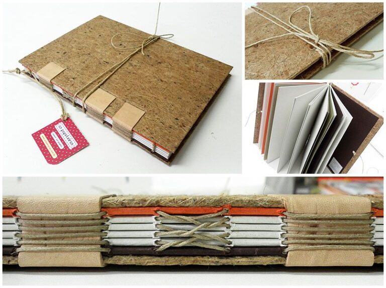
- Sustainability: Highlight the sustainable aspect of Japanese bookbinding, which often uses natural materials and recycling techniques. This may attract eco-conscious people and those concerned about environmental preservation.
- Exhibitions and Events: Attend art fairs, book exhibitions, cultural events and festivals to showcase your work and interact directly with the public. This can generate interest and appreciation for Japanese bookbinding.
Remember that innovation in Japanese bookbinding does not mean abandoning traditions completely, but rather finding creative ways to adapt and present them to diverse audiences. By doing so, you can expand your reach and appreciation for this beautiful form of art and craft.
Final considerations
Japanese bookbinding is an art form that has evolved over the centuries, incorporating new perspectives and approaches. Modernizing the color palette is just one way artisans are injecting a new breath of life into this traditional practice. By balancing cultural heritage with contemporary innovation, they are ensuring that Japanese bookbinding continues to delight and inspire present and future generations.
Therefore, by exploring the fusion of old and new, Japanese bookbinding practitioners are demonstrating that artistic traditions can be revitalized without losing their essence. The modernization of the color palette is proof that constant evolution is vital to keeping art forms relevant and appreciated.

